..
frej12: user interview
I conducted a small user interview with a test subject to evaluate their interaction and opinions of the dashboard, aiming to identify areas for improvement and a path forward.
Preparation
First Impressions
First, we simply opened the website, after a short explanation on its purpose.
What are your first impressions?
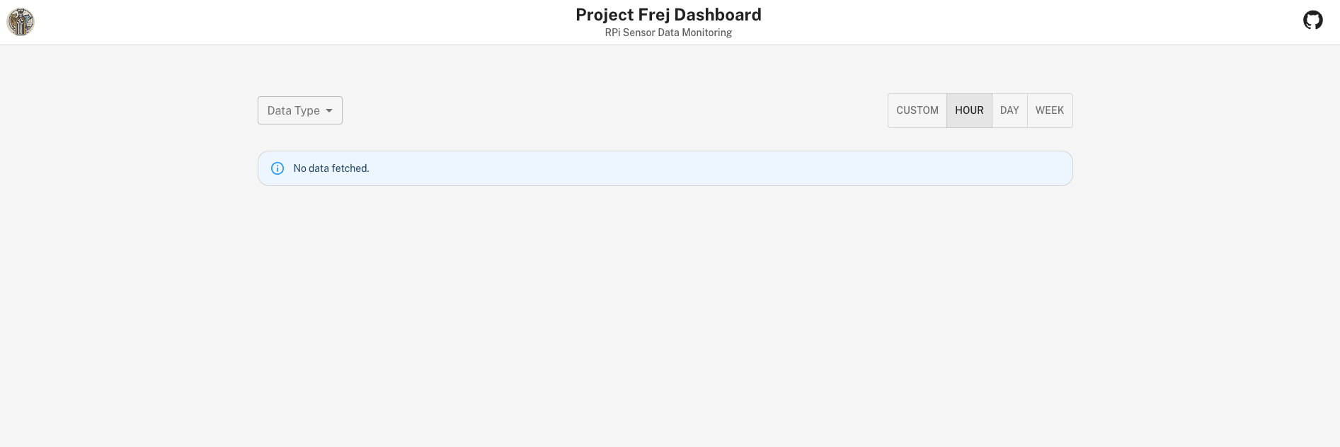
- Professional appearance: The domain name and copyright notice give a professional vibe.
- Unclear message: The “No data fetched” message is unclear, gives the feeling of there being some error.
- Initial steps: It’s not obvious what the first step should be. The “Data Type” label could be clearer, or instructions could be provided elsewhere.
- Time range labels: It’s not clear what “Custom/Hour/Day/Week” refer to. Do they indicate the last x time period or paginated data?
Task 1: View the temperature data for the last week
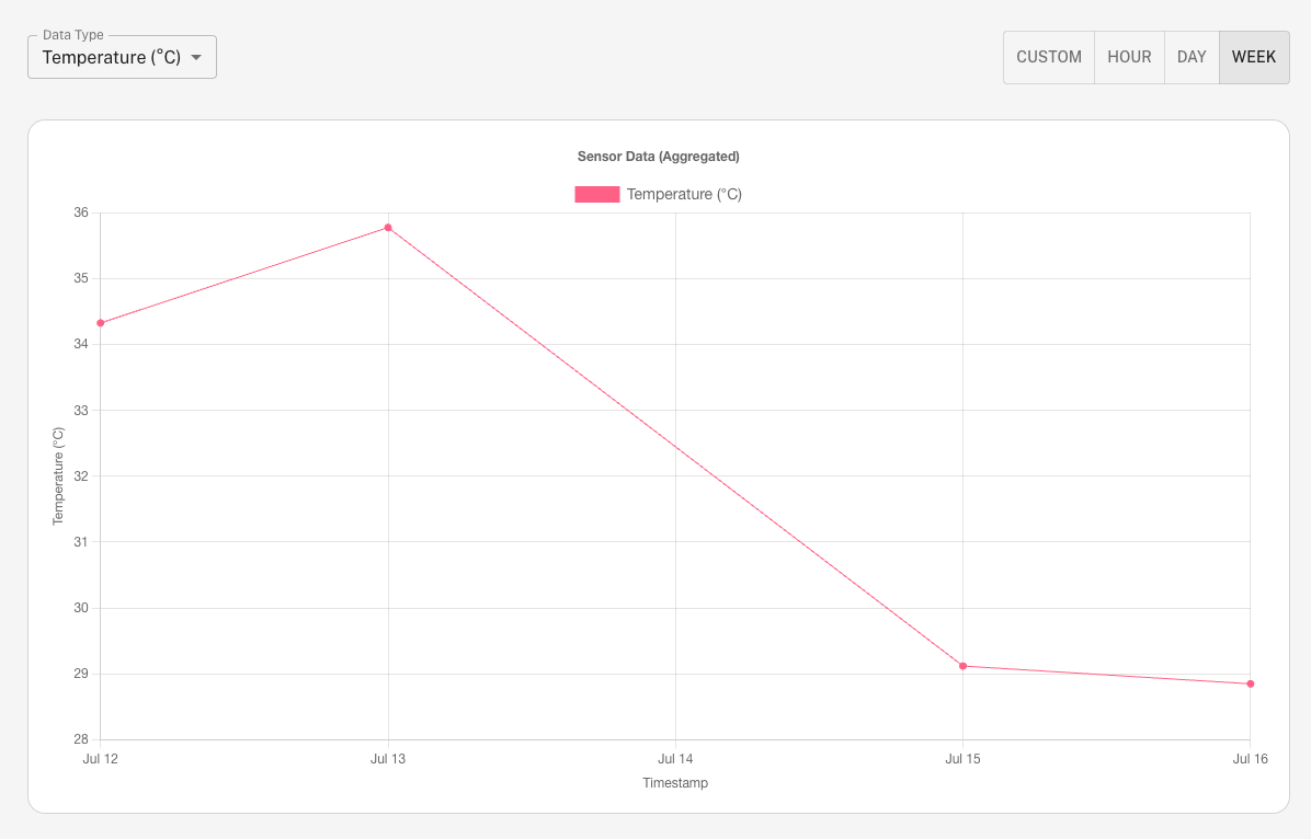
- Intuitive selection: Choosing a data type and range is intuitive once the task is given.
- No explanation for incomplete data: Only five days shown, it is not obvious why. Also, one day in the middle is missing, easy to miss, and no explanation as to why.
- Unclear aggregation: It’s not obvious that data points are averages. The title “Sensor Data (Aggregated)” should be clearer.
- Axis label: “Timestamp” is a weird label for the x-axis, since it refers to daily averages.
Task 2: Change data type to humidity and view data for the last day
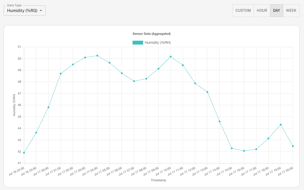
- Smooth transitions: The transition between data types and ranges is smooth.
- Appealing colors: The colors are appealing and appropriate.Color scheme is appealing and appropriate
- Hourly averages: It’s not clear that data points are hourly averages, as timestamps include minutes (HH:00).
- Time period confusion: It’s not obvious that the last 24 hours are what’s shown, rather than all data from the current calendar day.
- Clearer titles: Again, titles or tooltips should clearly indicate what data is being viewed. Not obvious.
Task 3: View the pressure data from specifically 08:00 two days ago
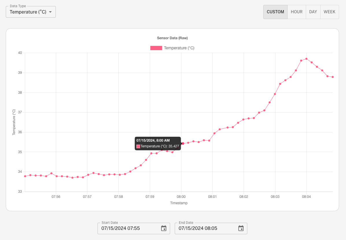
- Incorrect first instinct: The instinct is to use the “week” view, but that only shows averages.
- Custom date picker outside Screen: On a smaller screen, the custom date range selector is outside the current view after clicking the “Custom” button. This caused some confusion as one had to scroll down.
- Date selection: Not obvious that clicking the calendar icon brings up a date selection menu, instead the tester tried to manually enter the timestamps.
- Difficult to find specific data Not at all obvious how to get such specific granularity for that specific time.
- (This would require the user viewing a time range <= 2 hours long, as that is the cut-off for aggregation, but that is not explained in the interface.)
- Only HH:MM in axis labels: When viewing raw data, the timestamps only display minutes. But as the sensor data is taken every 10 seconds, it looks like there are several data points for the same time.
- Unclear selector labels: As with “Data Type”, more specific instructions for the “Start Date” and “End Date” selectors.
Task 4: View the temperature data for the last hour and try to identify any trends
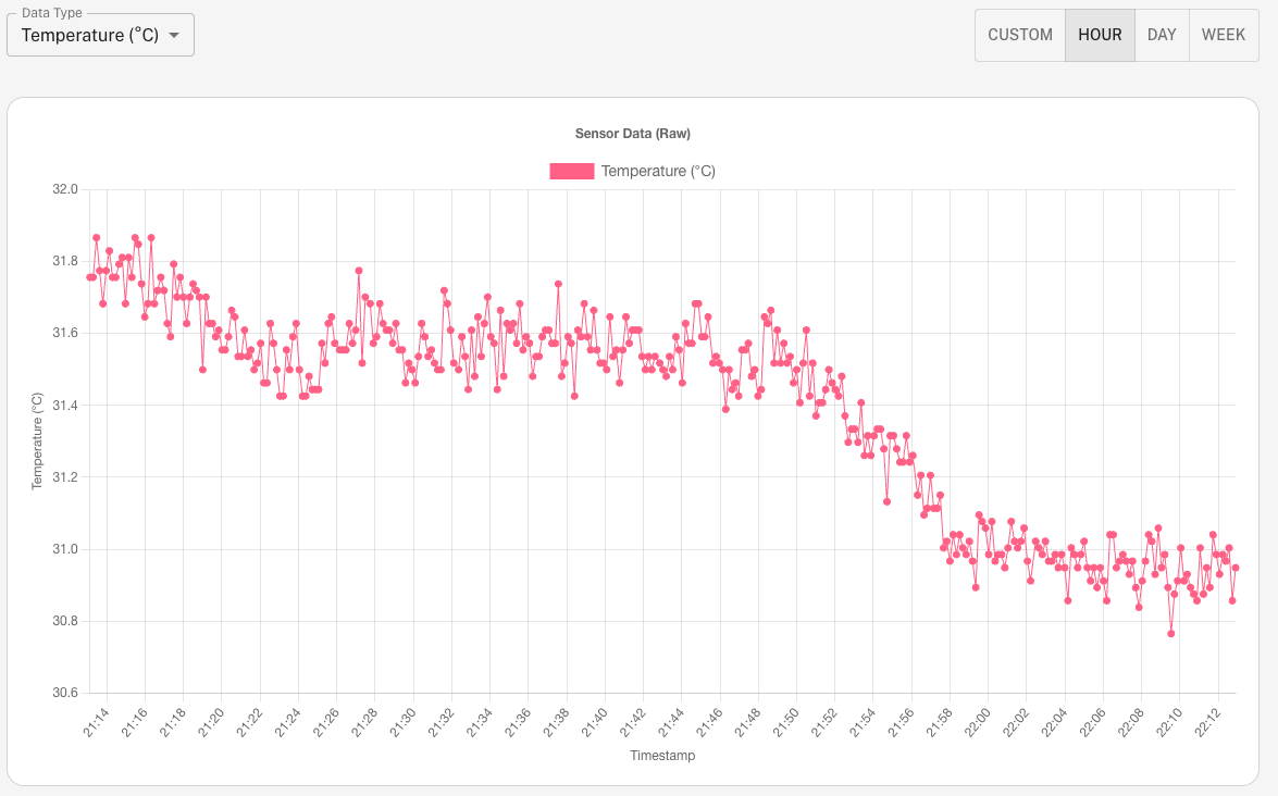
- Not much to say. Difficult to identify any trends, no regression or max/min or information about deviations.
- No zooming: Would be nice to be able to zoom in and out.
- No pagination: Again, flipping through the data would be nice.
- Data summaries: Any sort of written summary of the data would be nice.
Overall impressions
What were your overall impressions with the dashboard?
- The basic interface itself is intuitive and not buggy at all.
- Unintuitive how to browse the data or get at specifics.
- Confusing titles and labeling.
Requests
What are some things you wanted to do or expected to be able to do, but couldn’t?
- See tidbits about the data over time to make it more interesting (e.g. top 5 hottest days, biggest variation etc.)
- More sophisticated data browsing capabilities (pages, zooming in and out)
- Optionally showing more advanced analysis or statistics (trends, max/min, deviation, information about data over custom time ranges etc.).